Choosing paint colours is one of the most important decisions in interior design. The right colours can transform a space, whilst poor choices can make rooms feel smaller, darker, or uncomfortable.
Understanding Colour Psychology
- Blue: Calming, peaceful - ideal for bedrooms and bathrooms
- Green: Refreshing, balanced - works well in any room
- Yellow: Energising, cheerful - great for kitchens and dining rooms
- Red: Stimulating, bold - use as accents or in social spaces
- Grey: Sophisticated, neutral - versatile for any room
- White: Clean, spacious - perfect for small rooms and modern styles
Consider Your Room's Characteristics
Natural Light
- North-facing rooms: Receive cool light - use warm colours (yellows, reds, oranges)
- South-facing rooms: Receive warm light - can handle cool colours (blues, greens)
- East-facing rooms: Bright morning light - warm colours work well
- West-facing rooms: Warm afternoon light - cool colours balance the warmth
Room Size
- Small rooms: Light colours make spaces feel larger
- Large rooms: Can handle darker, bolder colours
- Low ceilings: Paint ceiling lighter than walls to add height
- High ceilings: Darker ceiling colours create cosiness
Creating a Colour Scheme
Monochromatic
Different shades of the same colour. Safe, sophisticated, and easy to achieve.
Analogous
Colours next to each other on the colour wheel (e.g., blue, blue-green, green). Harmonious and pleasing.
Complementary
Opposite colours on the colour wheel (e.g., blue and orange). Bold and energetic.
Neutral with Accent
Neutral base with one bold accent colour. Versatile and easy to update.
The 60-30-10 Rule
A foolproof formula for balanced colour schemes:
- 60%: Dominant colour (usually walls)
- 30%: Secondary colour (furniture, curtains)
- 10%: Accent colour (cushions, artwork, accessories)
Testing Paint Colours
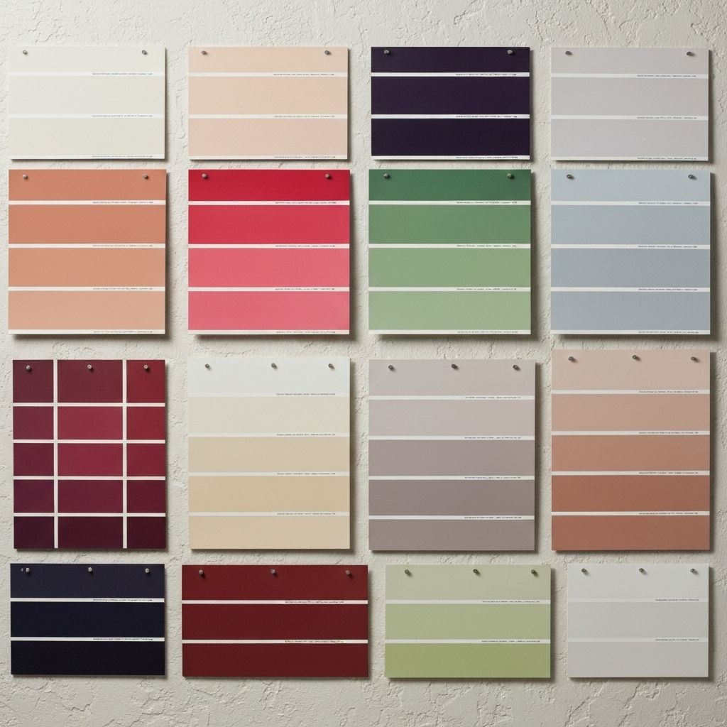
Never choose paint from a small sample card alone!
- Buy tester pots and paint large swatches (A3 size minimum)
- Test on multiple walls (light affects colour differently)
- View at different times of day
- Live with samples for at least a week
- Consider how colours look with your furniture and flooring
Popular Colour Trends
Timeless Neutrals
- Warm greys (greige)
- Soft whites and off-whites
- Warm beiges and taupes
Current Favourites
- Sage green
- Terracotta and warm earth tones
- Deep navy blue
- Blush pink
Room-by-Room Recommendations
Living Room
Warm neutrals, soft greys, or muted greens create welcoming spaces for socialising and relaxing.
Kitchen
White, cream, or light grey keep spaces feeling clean and bright. Add colour through accessories.
Bedroom
Soft blues, greens, or warm neutrals promote relaxation and sleep.
Bathroom
Light, fresh colours like white, pale blue, or soft green create spa-like atmospheres.
Hallway
Light colours make narrow spaces feel wider. Consider a slightly darker shade than adjoining rooms for definition.
Common Mistakes to Avoid
- Choosing colour based on trends alone
- Not considering existing furniture and flooring
- Painting before testing
- Using too many colours in one space
- Ignoring the finish (matt, satin, gloss) - it affects colour appearance
- Forgetting about woodwork colour
Professional Tips
- Start with your favourite piece of furniture or artwork and build colours around it
- Use lighter colours on walls and darker on floors for balance
- Paint woodwork first, then walls
- Consider flow between rooms - colours should complement each other
- Don't be afraid of colour, but start with one accent wall if nervous
Still unsure about colour choices? Peak Projects' experienced decorators can help you select the perfect colours for your home. We offer colour consultation services and professional painting and decorating. Contact us to discuss your project.
Ready to Start Your Project?
At Peak Projects, we pride ourselves on transparency, quality workmanship, and clear communication throughout every project.